Consider simplifying interface
-
First, I'd like to say VectorStyler is very impressive piece of engineering. I have no doubt it took years and years of development and the result is great. It has some glitches here and there, but overall it is fantastic
")
There is one area it needs to improve though. It is the UI. First time I opened the app, I was absolutely overwhelmed. There is 100 buttons visible immediately after opening a document. Main menu has hundreds of different items, most of them will be used very infrequently if at all.
Consider this menu:
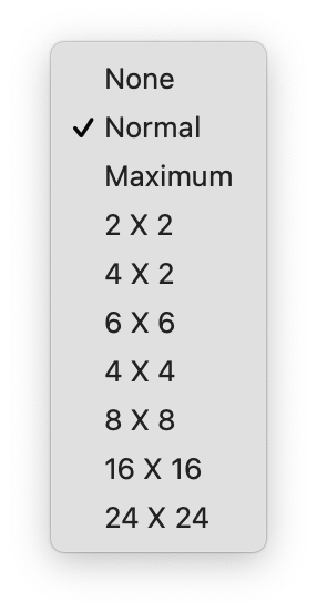
Average users will never know what this means. I consider myself to be slightly above average user in terms of computer graphics knowledge and I'm not sure what this means. Is it subpixel grid density used for anti-aliasing? It seems so, but switching between these barely makes a difference in regular documents. Most curious users will switch between them a few times, will not see a difference and keep it to, for example, 2x2. Then a few months later they will notice their artwork looks not as smooth as it should
Another example:
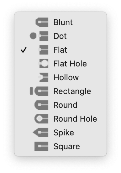
Almost nobody will use caps other than standard flat, square and round. And very unlikely users will set a different cap for start and end of stroke. But there is a rather extensive list of other things with the main options buried between them.
Next example is button list in layers panel:
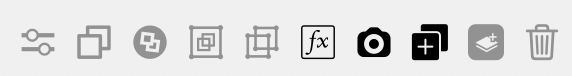
There are buttons for grouping and ungrouping layers which probably belong to main toolbar. There is also "duplicate" button. Nobody uses button for duplicating a layer. Then there is "clone" button. I have no idea how that differs from "duplicate". Delete layer button? Nobody uses anything other than backspace key for deleting layers.
The tools panel does not vertically fit into my 15" screen.
VectorStyler contains so many buttons and menu items and it makes app look harder to use that it really is.
Anyway, I'm looking forward to release of this app.
Good luck
-
@grix said in Consider simplifying interface:
There is one area it needs to improve though. It is the UI. First time I opened the app, I was absolutely overwhelmed. There is 100 buttons visible immediately after opening a document.
Agreed, the UI as it currently stands is overloaded. It was even worse previously, as has been discussed in other threads, so improvements have been made already.
Main menu has hundreds of different items, most of them will be used very infrequently if at all.
That doesn't mean they should be removed in all cases, though I agree that some additional simplification may be in order. That said, you can actually customize the menus if you are so inclined (VectorStyler -> Application Menu).
Average users will never know what this means.
They should read the documentation to find out: https://www.vectorstyler.com/documentation/overview/viewing/
Almost nobody will use caps other than standard flat, square and round.
Others will, and it is great to have those options. They are in alphabetical order, and you can create your own custom end cap styles within a document.
There are buttons for grouping and ungrouping layers which probably belong to main toolbar.
They seem completely appropriate where they are, though I agree they are non-essential unless you are working with a touch interface and accessing context menus or the keyboard would be inconvenient. You can add it to the main toolbar if you want (VectorStyler -> Customize Toolboxes; Toolbox: Context Panel).
There is also "duplicate" button. Nobody uses button for duplicating a layer.
Have you asked everyone on the planet that?
Then there is "clone" button. I have no idea how that differs from "duplicate".
Again, check the documentation: https://www.vectorstyler.com/documentation/objects/cloning/
The tools panel does not vertically fit into my 15" screen.
It can be customized to fit your environment (VectorStyler -> Customize Toolboxes; Toolbox: Application).
VectorStyler contains so many buttons and menu items and it makes app look harder to use that it really is.
Agreed. There should be simplified presets for those things and the first time the user starts the application there could be an option to select the Simplified or Advanced user interface, for example.
Anyway, I'm looking forward to release of this app.
Me too.
-
@grix Developer here: Welcome to VS and thanks for the feedback.
As previously said, VS has gone through several iterations of UI improvements and of course bug fixes.
Some things can be better explained and presented and the UI/UX will be improved contunuously even after the first version release.There are a lot of new features here compared to other apps (most not visible at first look).
For example, stroke cap shapes can be user defined, so that list could get even longer if new caps are defined.The clone duplication mode copies the object but keeps a live link to all aspects of the original object. If a property of the original is modified, all clone duplicates will mirror that property. If the property is modified on then clone, it will detach and will not mirror that property.
The bottom line is that VS will be more complex than other illustration apps, and I will try to mitigate this by continuously improving the UI and UX.
Any feedback in this regard, and of course bug reports or feature requests is welcome.
-
@vectoradmin Thanks for clarifying what "clone" does
It seems like what other apps call symbols if I'm not mistaken.As I understand, this app will be targeted to professional users, not beginners?
-
@grix said in Consider simplifying interface:
It seems like what other apps call symbols if I'm not mistaken.
Similar but not quite... symbols are there too (Panel -> Styles -> Symbols).
-
@grix Some of the symbol implementations are similar to clone. But in VS there is a separate symbol feature also, with style overrides.
In VS, the clone is more like a light duplicate, while VS symbols plain references to (symbol) objects without the possibility to directly change a style (fill or stroke), unless styles and overrides are used. Of course image and shape effects can be added over a symbol without changing its content.One interesting way to explore how VS symbols work, is to use object references:
- select an object (or group) that should be used as a symbol.
- go to Object -> Object Options, give the object a name, and in the Role button enable the Symbol option, then confirm with Ok.
- open the Panels -> Styles -> Symbol panel, and the new symbol should be visible there.
- create a couple of symbol instances (drag & drop).
- then modify the original object (the one with the role), to change all symbols instances.
And of course, the above reference trick can be combined with having multiple canvases (with each canvas having multiple artboards) in a single document.
VS can be a bit hard for beginners, but most of the basic features are very similar to other apps, it just offers more detail.
Yes it is more suited for professionals, but also users who are familiar with illustration apps, and want more out of the box, or don't want subscription -
After a few more hours with VectorStyler, a few other issues came up:
Toolbar should be customizable. Perhaps it is, but I did not manage to find how
And default button set should be shrunk a little. 6 first buttons in toolbar (save document, import graphics, etc.) are mostly accessed using keyboard shortcuts as most users are familiar with them. No I did not ask every person in the world if they know what CMD-S does, but none of standard apps like Pages and Keynote in MacOS include toolbar buttons for file management.I can't see a way to set alpha value for color in color picker. Sometimes it is not a big issue, but sometimes is. A few scenarios:
-
If I want to set transparent color for text, I can't do that from within toolbar. I have to look at Appearance panel.
-
If I want to set transparent color for mesh gradient node, I cannot do that at all.
-
-
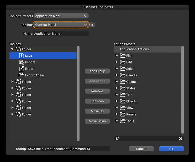
@grix By 'toolbar' I think you mean the horizontal bar with buttons at the top? If so, you can customize it by choosing 'Customize Toolboxes' from the VectorStyler menu, then choose 'Context Panel' in the second dropdown menu:
Btw, the size and lines count of the toolbar on the left side of the screen can be customized from Preferences > Panels.
And the size of the entire interface can be adjusted in percents from Preferences > User Interface > Interface Scaling.
………………………………………………………
You can change the opacity of each control point of the mesh from the Transparency panel — select the point and drag the Opacity slider there.
-
@grix I think a those save buttons could be removed from the default toolbar.
The opacity of a mesh node can also be set by double clicking on the node, otherwise of course the Transparency panel is to be used for this and text also. -
@vectoradmin An issue here is that double-clicking (which I tried and @grix too, I'm sure) only works with the Mesh Gradient tool, however most users will try to click or double-click and change the opacity of the mesh node when in node editing mode, and this doesn't pop the panel under the cursor as it does in Mesh editing mode.
-
@b77 Yes, that is the case. Would adding an opacity slider to color panel (at least in vertical mode) mitigate this?
-
@vectoradmin Just popping the same panel when double-clicking a node in node editing mode would be great, but currently it conflicts with segment splitting.
If you add another slider to the color panel, the panel can get taller — not sure if this is desirable for people with 13" screens.
You could however move some buttons around and stay with the same panel size — something like this:
(Btw, if you move the 'Swap Fill with Stroke' button, you could make it bigger).
-
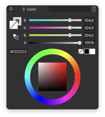
@b77 Added an opacity slider to the color panel (bottom). I choose a different layout as proposed, since the area with the color wheel can also contain rectangular color picker.
-
@vectoradmin Great! But I still think it would make more sense to place the 'Swap Fill with Stoke' button under the big Fill and Stroke buttons.
-
@b77 I second putting the swap stroke and fill directly under the stroke and fill boxes - that's where I keep going to look for it and then realize it's over on the other side of the panel
🍎 macOS Tahoe 26.2, Mac mini (M1, 2020), Chip Apple M1, Memory 16 GB
Cintiq 27QHD Display and LG Ultra HD Display -
Added to the backlog.
-
@Boldline swap stroke/fill button will stay next to the hex field for now. The place under the fill box is taken by the gamut map button (not visible if color is in gamut).
-
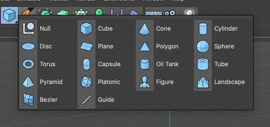
Consider color-coding the icons based on category to make it look more organised and easier to track-down what you want, for example:
Blue - Shape Generators (splines, primitives, text)
Green -Path operations (booleans, cuts, transforms)
Purple - Deformers (distort, wrap, liquify)
Magenta - Procedural effects (patterns, contour, gradients)
Orange - Workspace related functions (zoom, pan, artboard etc)Cinema4D makes consistent use of this and it’s one of those scalar interfaces where you can add a thousand more functions without ever feeling bloated, disorganised and hard on the eyes.
-
@Kyriakos The toolbar has separators — it’s enough for me (unless you consider them too thin?) and I really don’t want to have to look at a multicolored string of icons that interferes with the nice combination of colors of the artwork on the canvas. To me it would be a constant annoyance. It’s enough that I have too many colors on the right — the RGB or CMYK sliders, the wheel, the color-coded layers and the color bar.
IMO, and sorry to disagree with you on this topic.

-
@b77 Wasn't talking about multi-coloured icons but monochromatic tinted ones. For example here's all primitives having a light blue tint, and this scheme works especially best in busy scenes.