Consider simplifying interface
-
@grix Some of the symbol implementations are similar to clone. But in VS there is a separate symbol feature also, with style overrides.
In VS, the clone is more like a light duplicate, while VS symbols plain references to (symbol) objects without the possibility to directly change a style (fill or stroke), unless styles and overrides are used. Of course image and shape effects can be added over a symbol without changing its content.One interesting way to explore how VS symbols work, is to use object references:
- select an object (or group) that should be used as a symbol.
- go to Object -> Object Options, give the object a name, and in the Role button enable the Symbol option, then confirm with Ok.
- open the Panels -> Styles -> Symbol panel, and the new symbol should be visible there.
- create a couple of symbol instances (drag & drop).
- then modify the original object (the one with the role), to change all symbols instances.
And of course, the above reference trick can be combined with having multiple canvases (with each canvas having multiple artboards) in a single document.
VS can be a bit hard for beginners, but most of the basic features are very similar to other apps, it just offers more detail.
Yes it is more suited for professionals, but also users who are familiar with illustration apps, and want more out of the box, or don't want subscription")
-
After a few more hours with VectorStyler, a few other issues came up:
Toolbar should be customizable. Perhaps it is, but I did not manage to find how
And default button set should be shrunk a little. 6 first buttons in toolbar (save document, import graphics, etc.) are mostly accessed using keyboard shortcuts as most users are familiar with them. No I did not ask every person in the world if they know what CMD-S does, but none of standard apps like Pages and Keynote in MacOS include toolbar buttons for file management.I can't see a way to set alpha value for color in color picker. Sometimes it is not a big issue, but sometimes is. A few scenarios:
-
If I want to set transparent color for text, I can't do that from within toolbar. I have to look at Appearance panel.
-
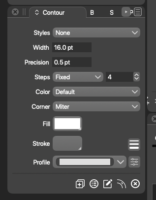
If I want to set transparent color for mesh gradient node, I cannot do that at all.
-
-
@grix By 'toolbar' I think you mean the horizontal bar with buttons at the top? If so, you can customize it by choosing 'Customize Toolboxes' from the VectorStyler menu, then choose 'Context Panel' in the second dropdown menu:
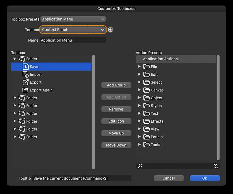
Btw, the size and lines count of the toolbar on the left side of the screen can be customized from Preferences > Panels.
And the size of the entire interface can be adjusted in percents from Preferences > User Interface > Interface Scaling.
………………………………………………………
You can change the opacity of each control point of the mesh from the Transparency panel — select the point and drag the Opacity slider there.
-
@grix I think a those save buttons could be removed from the default toolbar.
The opacity of a mesh node can also be set by double clicking on the node, otherwise of course the Transparency panel is to be used for this and text also. -
@vectoradmin An issue here is that double-clicking (which I tried and @grix too, I'm sure) only works with the Mesh Gradient tool, however most users will try to click or double-click and change the opacity of the mesh node when in node editing mode, and this doesn't pop the panel under the cursor as it does in Mesh editing mode.
-
@b77 Yes, that is the case. Would adding an opacity slider to color panel (at least in vertical mode) mitigate this?
-
@vectoradmin Just popping the same panel when double-clicking a node in node editing mode would be great, but currently it conflicts with segment splitting.
If you add another slider to the color panel, the panel can get taller — not sure if this is desirable for people with 13" screens.
You could however move some buttons around and stay with the same panel size — something like this:
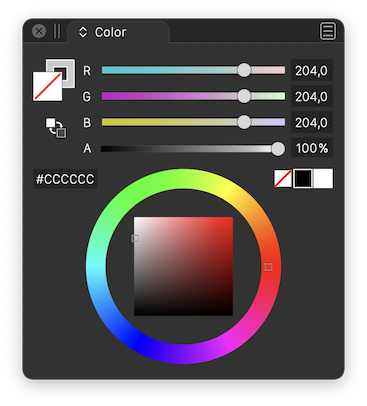
(Btw, if you move the 'Swap Fill with Stroke' button, you could make it bigger).
-
@b77 Added an opacity slider to the color panel (bottom). I choose a different layout as proposed, since the area with the color wheel can also contain rectangular color picker.
-
@vectoradmin Great! But I still think it would make more sense to place the 'Swap Fill with Stoke' button under the big Fill and Stroke buttons.
-
@b77 I second putting the swap stroke and fill directly under the stroke and fill boxes - that's where I keep going to look for it and then realize it's over on the other side of the panel
🍎 macOS Tahoe 26.2, Mac mini (M1, 2020), Chip Apple M1, Memory 16 GB
Cintiq 27QHD Display and LG Ultra HD Display -
Added to the backlog.
-
@Boldline swap stroke/fill button will stay next to the hex field for now. The place under the fill box is taken by the gamut map button (not visible if color is in gamut).
-
Consider color-coding the icons based on category to make it look more organised and easier to track-down what you want, for example:
Blue - Shape Generators (splines, primitives, text)
Green -Path operations (booleans, cuts, transforms)
Purple - Deformers (distort, wrap, liquify)
Magenta - Procedural effects (patterns, contour, gradients)
Orange - Workspace related functions (zoom, pan, artboard etc)Cinema4D makes consistent use of this and it’s one of those scalar interfaces where you can add a thousand more functions without ever feeling bloated, disorganised and hard on the eyes.
-
@Kyriakos The toolbar has separators — it’s enough for me (unless you consider them too thin?) and I really don’t want to have to look at a multicolored string of icons that interferes with the nice combination of colors of the artwork on the canvas. To me it would be a constant annoyance. It’s enough that I have too many colors on the right — the RGB or CMYK sliders, the wheel, the color-coded layers and the color bar.
IMO, and sorry to disagree with you on this topic.

-
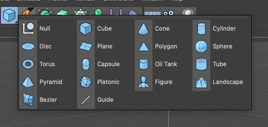
@b77 Wasn't talking about multi-coloured icons but monochromatic tinted ones. For example here's all primitives having a light blue tint, and this scheme works especially best in busy scenes.
-
@Kyriakos Yes, I know Cinema4D's UI (it's not some obscure app), so I did understand what you mean. I still disagree, I'm sorry. I want to be "alone" with the nice combination of three or four colors of my artwork and not have blue, green, orange and violet buttons on the side.
The developer might very well agree with your suggestion and implement this (everybody knows he's very open to our ideas), but then I would change it or make my own monochrome icon set.
-
@b77 I prefer the monochrome look myself. If colors get added, as long as there is the option to switch to monochrome if I prefer it, I don't mind. Affinity has that option and I set it to monochrome.
-
@Kyriakos An option towards this could be added in the future (after version 1). There are no technical obstacles on this one.
The monochrome UI theme will be kept as a primary theme in the future also.
In my opinion (as a developer) having colors in the UI unrelated to the content being edited can distract from the content (and maybe visually influence the perception of the content).
But VS is about having options so I add this for the post version 1 backlog. -
@vectoradmin said in Consider simplifying interface:
In my opinion (as a developer) having colors in the UI unrelated to the content being edited can distract from the content (and maybe visually influence the perception of the content).
This is my opinion as well as a professional graphic designer
-
Fair enough, having it as option would be great.
Another small thing, it would be great if the tab length adjusted to the text to leave more breathing room for the rest.