Snapping panels redundancy
-
What I've been wondering for a while. Why is there so much duplication?
Wouldn't it be much clearer and better to learn and remember without redundant double display?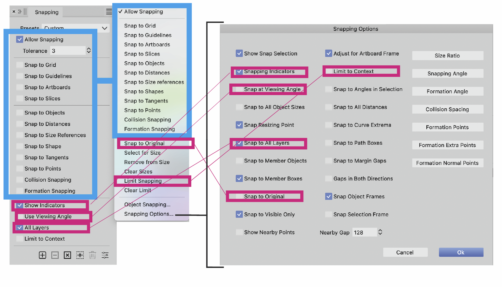
It's highly confusing.
You create a mental map of the application for yourself where to find things.
Keeping with that analogy, Amsterdam is here and there!
Or, my laptop is at work and on the sofa!
That is not possible. -
This post is deleted! -
@Ayo said in Snapping panels redundancy:
Wouldn't it be much clearer and better to learn and remember without redundant double display?
Some redundancy is needed and is present in other apps also. In this case a few more important options are placed also outside of the modal view that contains all the options.
-
@VectorStyler
I would take commonly used options + extended/all options or something like that. Level 1 and 2, now you have three.
Don't understand your reasoning, but I am a user responding from my user experience and not a developer.
Thanks anyway -
@Ayo Maybe those red checkboxes of the panel moved to the menu?
The problem with the "Snap to..." options (both panel and menu) is that the panel context can be rotated into fewer options (title double arrow) so these should be in the menu also for that case. -
@VectorStyler
You mean this little rascal?
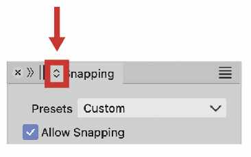
It's completely new to me. Never noticed. I need some time to get used to and explore it. Is a up and down scaling symbol. Usually combined with a slider (like Stroke Weight). Is this the right helpful explanatory symbol and place for this? Clutter on the tab is my first reaction. I could easily do without it. Wonder if anyone uses this and narrows down the list.
-
@Ayo said in Snapping panels redundancy:
I could easily do without it.
Note
I increasingly experience that eliminating a problem/object is a solution to more problems. -
@Ayo said in Snapping panels redundancy:
You mean this little rascal?
Yes. And this is now indispensable with the complex panels VS has. Most panels in 1.2 were reduced to a simplified state, and this button is used to get to more options inside the panel.
-
AI has only two sets of options for the panels, IIRC — one displaying all the options
and the other displaying a reduced set. This why it can do without a button in the
tab — there's a 'Show/Hide Options' command in the panel's menu and that's it.Since VS goes from a minimal set of options to intermediary set to full set, this
'expand' button in the tab is needed.Should VS have only minimal and full sets for each panel? I don't know…
-
@b77
In any case, it does not help to solve this location spaghetti tombola
 !
!