Posters using VS: from blend, image effect,... to pattern etc.
-
Work in progress

I don't know if it's worth showing this at this stage or if it even can belong on this forum, but I thought it might be useful for showing the various ways of manipulating vector paths with VS (for those who might be thinking about acquiring VS). My idea is simply to test various/many VS features by creating poster-like graphics (rather abstract). Just let me know if it doesn't belong here or if it is not appropriate

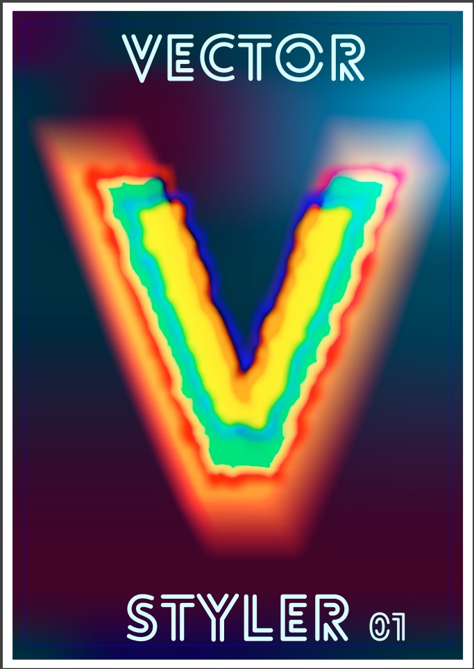
1st - Mesh, transform, image effects, colour blends
-
@Pat
while i like the style of the Font for "Vectorstyler"
the "V" seems a little... well diffus for me
just my two centsbut i always respect anyone who creates something
-
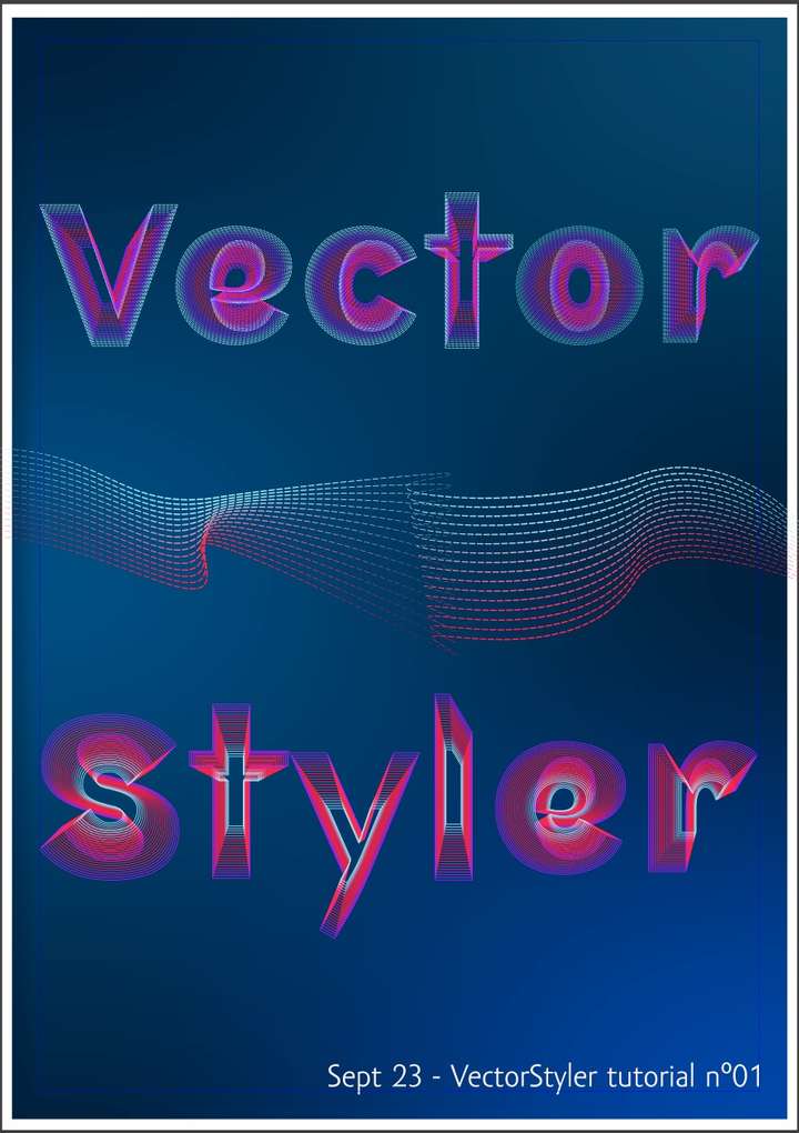
A second one, just a print screen... still WIP

Mesh, typo, blending, strokes changes, alignment. There are many possible variants

-
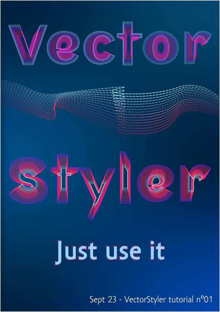
I can add 'effect on the stroke':
-
@Pat
Guess its a blend in the middle.
Find that can certainly keep up with the with a Particle brush
from Flamepainter.For anyone who is interested hier a Link:
https://www.escapemotions.com/products/flamepainter/about?//products/flamepainter/index.php
-
@Subpath yes, quickly done to place a graphic in the middle but I should have taken a bit more time to finish it

Nice apps but are they vector or bitmap ? I guess bitmap...
-
@Pat said in Posters using VS: from blend, image effect,... to pattern etc.:
but I should have taken a bit more time to finish it
looks good to me as it is

.
.
yes, the result of Flame Painter is a bitmap it has a vector output,
but this is in my eyes totally useless.The vector graphic import is one of the things i like in
Flame Painter. Works via vector layer, only one path is allowed
per vector layer, but many vector layer.You can import an .svg path from VS and put any particle brush on it.
The whole thing remains resolution independent internally until its exported.I will post something here where I have recreated a graphic in VS which
i made with Flame Painter. But that will take some time.
-
@Subpath Would be great to see here what can be done with VS & FP

-
@VectorStyler When I sent you the 5-artboards file, I described an issue with colour blending that I could not see in the pdf file after export (artboard n°3). Could you reproduce this issue?
Thanks
-
@Pat said in Posters using VS: from blend, image effect,... to pattern etc.:
I described an issue with colour blending that I could not see in the pdf file after export (artboard n°3). Could you reproduce this issue?
Yes, I noticed are several problems on artboard 1 and 3. I added this to the backlog, but could not yet find a solution.
-
For what it's worth... an attempt to recycle some previously produced graphics. There some issues with pdf export and colour blending.
Mesh, mask (gradient mask), blending, transparency, transform...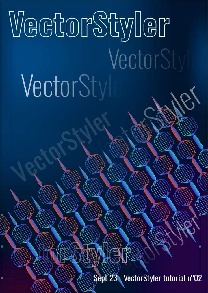
-
@Pat yes, some of these PDF exporting issues can be replicated here also.
-
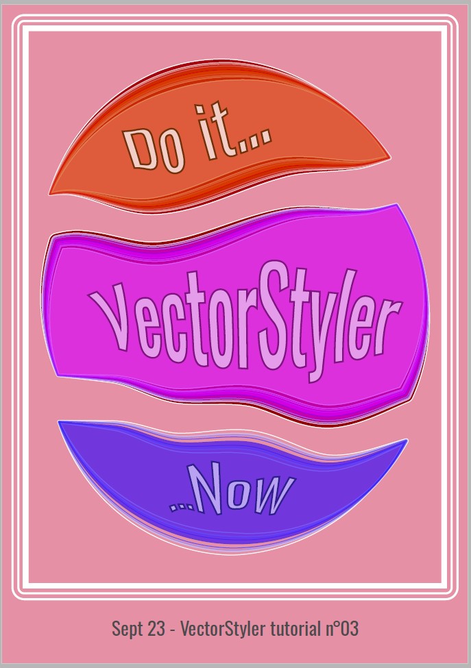
I wanted to test the knife tool and then the contour tool and the pdf export.
It was first a sphere that I cut in 3 parts (knife tool) and I've applied the contour tool (Q), changed the stroke profile etc.
Many options & some glitches but fun to use... this is an exported pdf cymk, therefore the colours are a bit... well less vivid than in rgb
-
@Pat
like the colors
the contour looks nice too
-
@Subpath thanks but this is very simple because it's mainly to learn (and memorise, which is more difficult
 ) the many features & functionalities of VS.
I'll start a bigger project when I'll have more free time.
-
@Pat said in Posters using VS: from blend, image effect,... to pattern etc.:
it's mainly to learn
Yes, this is also one of my main fun when creating tutorials
and you always learn a thing or two too, when you have to explain a thing
-
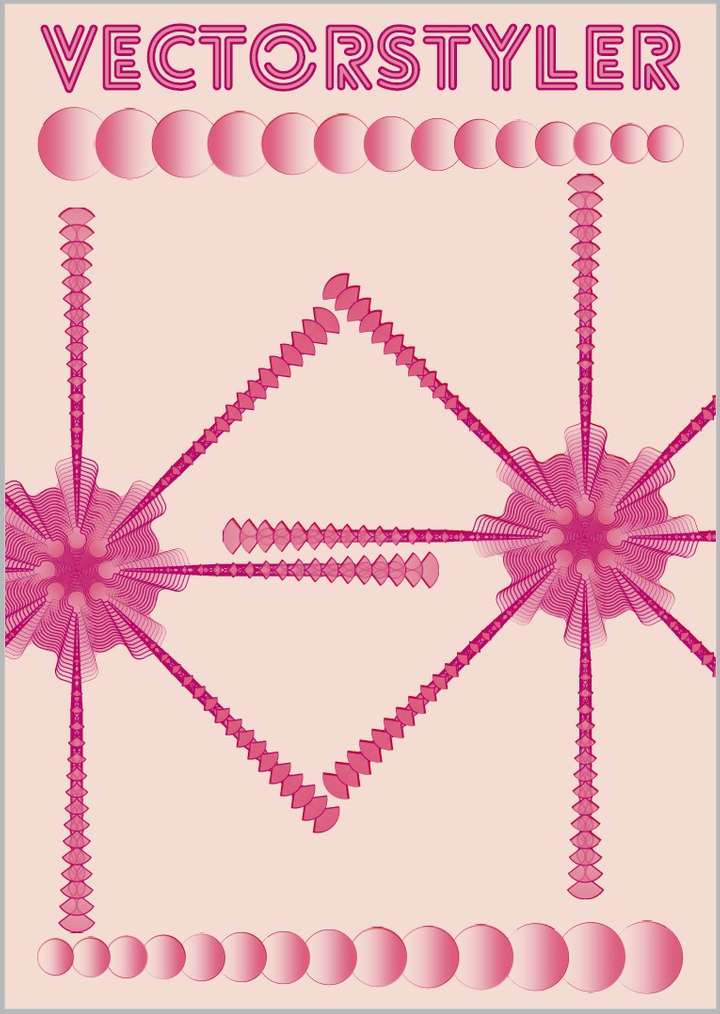
Very simple design almost monochromatic - Blending, colour gradients & white noise, transform
-
@Pat
great, like it
even for the color
good has nothing to do with complex designs
so, no need to excuse for simple thingsreminds me a bit on "Russian Futuristic" graphics style
-
@Subpath Thanks
 well I don't really know what is this kind of design but I'll look for it
-
@Pat
"Russian Futurism" is a kind of painting style
from the 1920 i guessand there was i time where kind of modernize
graphic style came up which going back to this graphic
style languageHere a link i found, not really what i meant
but gives a impression
https://www.google.de/imgres?imgurl=https%3A%2F%2Fmir-s3-cdn-cf.behance.net%2Fproject_modules%2F1400%2F6d57ea38406405.5766c7842bf3d.jpg&tbnid=geLceAPiDX9SBM&vet=12ahUKEwiiwoKk1YSAAxWJmycCHYh2DrIQMyg3egQIARBJ..i&imgrefurl=https%3A%2F%2Fwww.behance.net%2Fgallery%2F38406405%2FHistory-of-Russian-Graphic-Design%3Flocale%3Dde_DE&docid=Nkzbp2oYp8shOM&w=1400&h=1277&itg=1&q=russian futurism graphic illustration&ved=2ahUKEwiiwoKk1YSAAxWJmycCHYh2DrIQMyg3egQIARBJ