On Ruler, guidelines and indicator line styles
-
Some observations...
1. Rulers
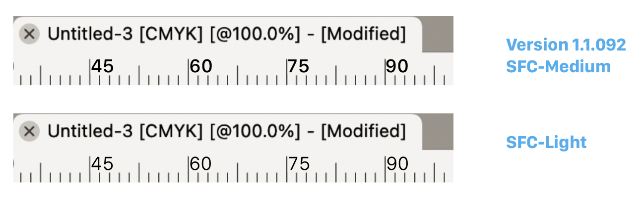
For my taste, the numbers in the ruler are a bit blunt or coarse. The font size is now equal to the default overall font size but looks bigger because they are (Lining) figures. I would suggest reducing the size for the rulers values slightly to Small Caps (Old Style) x-height size. Say 12 > 9 pts (75% to 80%)
Consequence, a better hierarchy between primary and secondary (to which the ruler belongs in my opinion). Then it does not compete with primary text elements and values. Can become more compact and more precise/fine.
And... looks so much better.Note
The Tick Lines are also scaled/shorter in the comparison (see PDF)2. Guidelines and indicator line styles
It seems to me that the line width values for indicators and rulers have been carried over from the pre-retina era to the present without correction. Lines are barely visible. About half a hairline. Fortunately, most indicator values can be adjusted. I often double the values.
For the guidelines, however, I can only adjust the color. Something I like to do. But if I want to adjust the color to my preference, a subtle non-repro blue, say 70% cyan (Freehand Corporate color : ) ) the visibility disappears completely. You can only use high contrast colors (black, full red, blue, green) because the line is so thin.
Can the color setting be enriched with a line value? Similar to the (hidden) artboard color/border setting or somewhere else? Or a better robust default of course since there are enough settings to cope with.
3. Artboard guidelines
Perhaps a known issue but worth mentioning; artboard rulers cannot be altered manually now in contrast to canvas guides. Only numerically. Bug?
-
@Ayo said in On Ruler, guidelines and indicator line styles:
I added these to the backlog. I think they are doable.
For (3) try Option+ dragging from the ruler corner (upper-left), to visually set the origin.
Important to know that artboards of a canvas share a common coordinate system and there is a single (common) origin for all artboards. -
@VectorStyler said in On Ruler, guidelines and indicator line styles:
For (3) try Option+ dragging from the ruler corner (upper-left), to visually set the origin.
You mean Cmd I think. But that is for the origin. I referred to horizontal and vertical artboard guides.
Correction on my point 3. previous post:
"artboard rulers cannot be altered manually " should be:
"artboard GUIDES cannot be altered manually"While I am testing your suggestion I can't create artboard guides at all. I am selecting 'Artboard' but they immediately jump to canvas now. Strange, maybe time to reboot.
-
@Ayo said in On Ruler, guidelines and indicator line styles:
While I am testing your suggestion I can't create artboard guides at all.
Is this when dragging guidelines from the ruler, or creating in the Guidelines panel?
When dragging from the ruler, drag over the artboard and press Control, then it should be an artboard guideline.
-
@VectorStyler said in On Ruler, guidelines and indicator line styles:
when dragging guidelines from the ruler
That works!
First drag then press Ctrl.
Not at the same time, you'll get the unit selector. -
@Ayo said in On Ruler, guidelines and indicator line styles:
First drag then press Ctrl.
BTW: this is a thing over all tools in VS, pressing a modifier key before the mouse or after the mouse leads to different actions.
-
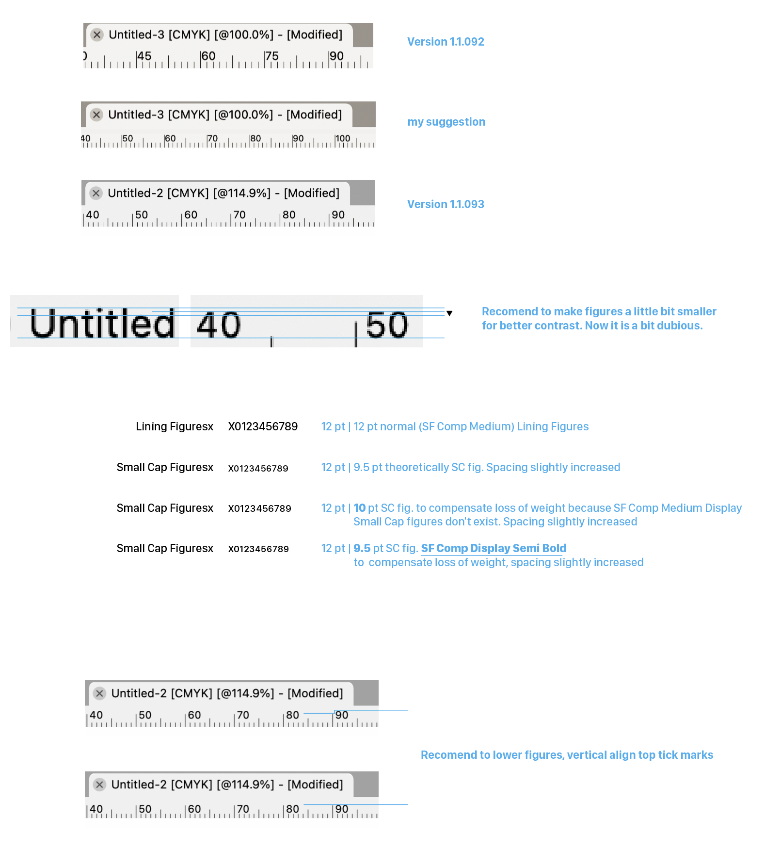
I noticed that the ruler has been modified in version 1.1.093. Probably because of my idea to use Small Caps Figures for the rulers.
Almost there but have a few more comments on that.
- make figures a tiny little bit smaller for better contrast. Now it's a bit dubious. Illustrated also option to use different font for SC lookalike to compensate loss of weight.
- lower figures, vertically align top tick marks as before.
-
@Ayo I can't say I like the numbers being so close to the small tick marks, just so
the top will be at the same level with the top tick marks.And while I personally wouldn't mind these to be a bit smaller, I have to ask what about
people with poor eyesight?MacBook Pro (Intel) running Monterey 12.6.4
-
@Ayo said in On Ruler, guidelines and indicator line styles:
I noticed that the ruler has been modified in version 1.1.093. Probably because of my idea to use Small Caps Figures for the rulers.
Yes.
I did hesitate a bit with the font size. It can become hard to read at smaller sizes.
-
Small Cap Figures are actually not a different font size but only a different style.
Plus spacing helps readability.
-
@b77 said in On Ruler, guidelines and indicator line styles:
I can't say I like the numbers being so close to the small tick
Indeed too close in the quick visual example. Example was about top lining. Long tick marks should be little longer to give more space below. All about detailing
-
@Ayo Yes, the top tick marks could be just a bit taller.
Using small caps figures means running code that converts the values calculated
in "normal" numbers to small caps numbers, with possibly constant slower refresh
rates (lag) when you pan or zoom in or out.And I'm not sure this is necessary, as the numbers can simply be displayed in Medium
instead of Regular, let's say.(But as I said, personally I think the size & weight is a good compromise now).
-
@Ayo Btw, do you know you can show the position of the selection on the
rulers if you enable 'Show Position in Ruler' in Prefs > Performance? -
@b77 Yes, ticked on, like that to see if I want rulers
-
@Ayo said in On Ruler, guidelines and indicator line styles:
Small Cap Figures are actually not a different font size but only a different style.
FYI and perhaps superfluously, but I didn't know, that but SF-Compact has real drawn (not simulated) SC figures in its (rich)repertoire!

-
@Ayo I will try find a way to use those for the ruler.
The problem is that in VS the document and the UI is rendered with different engines.
The document is rendered with VS own rendering engine, and it has all the OpenType font features.The UI is rendered with the host OS (MacOS or Windows) and this one does not provide access to all these OpenType features.
Maybe the ruler needs its own font settings in the preferences?
-
@Ayo Maybe I'm dense, but why should Small Caps be used for the rulers instead of
normal numbers in a thicker weight of SF Pro at a smaller font size?MacBook Pro (Intel) running Monterey 12.6.4
-
@VectorStyler said in On Ruler, guidelines and indicator line styles:
Maybe the ruler needs its own font settings in the preferences?
Well, it's not such an important point, but I stumbled over the big numbers. Looks a bit childish and/or for the elderly. Nothing wrong with that, but not technically anyway.
A separate setting? Since there are already so many settings, there is always something to add. It would then only give the small/large option. Don't make it too complicated.
Could also be a matter of weight to bring about some contrast. Look...
-
@Ayo said in On Ruler, guidelines and indicator line styles:
Could also be a matter of weight to bring about some contrast. Look...
I think even better than the SC. Matches (belong to) the tick line style!
-
@b77 said in On Ruler, guidelines and indicator line styles:
why should Small Caps be used for the rulers instead of
normal numbers in a thicker weightBecause they are optimized for it on the drawing board.