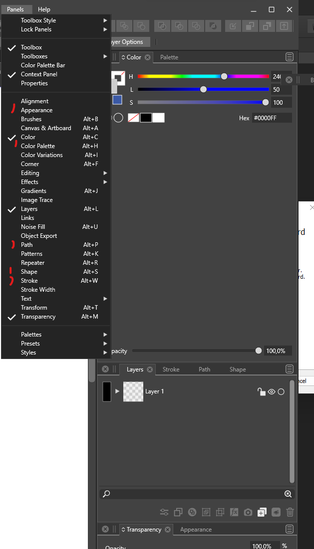
Misleading use of check marks in Panels menu
-
I only now discovered that the icon next to used panels in the Panel menu only appears next to panels that are active in a group of panels.
The icon should be displayed next to all used panels.
VS 1.1.042 macOS and Win
")
-
@Ingolf Not sure about this. In Affinity it is as you say, in AI it is as in VS.
The problem here is that if a checkbox is shown, the user may expect the panel to be visible somewhere on the screen and it is not.Lets see what others think.
-
@VectorStyler said in Misleading use of check marks in Panels menu:
@Ingolf Not sure about this. In Affinity it is as you say, in AI it is as in VS.
The problem here is that if a checkbox is shown, the user may expect the panel to be visible somewhere on the screen and it is not.Lets see what others think.
Hm, you're right. It's probably introduced after the panels could be minimized to icons too.
That's okay. The methodology doesn't break anything. And it might be useful if VS one day goes the icon route too.
-
Would three states for the checkmarks work for this or confuse users?
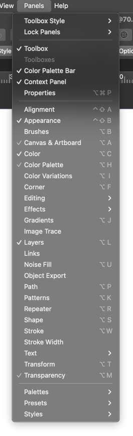
Or a hyphen/line instead?

In any case, the checkmarks look too big on Windows… I would pick some smaller checkmark glyph that has a smaller than 90° angle, like on the Mac.