Isometric Drawing Tutorial
-
ok I will temper myself
")
but is hardbtw back when i worked in digital printing there was an ice cream truck
that drove by in the summer from time to time. And every now and then
our boss spent an ice cream for all employees (40 people).
-
@Subpath Cool Boss indeed !
-
Nice, but comments are off.
-
@Devil-Dinosaur Great tutorial, thanks!
@VectorStyler Watching people use the tools you created yourself must be rewarding

-
@encart said in Isometric Drawing Tutorial:
@VectorStyler Watching people use the tools you created yourself must be rewarding.
It is!
-
@plrang Thank you !
Comments are off because my faith in human behavior on social media is quite low.

I know there are small mistakes, hesitations and a too slow pace in what I show. It's definitely not professional standards. Anyway, I just try to help and I still believe that some of the information I give are worthy, despite the way I communicate it. And I don't need to be judged by people whose only effort was to press "play" on their device.
I also think that people can come to chat on this forum if they have questions or they need clarification.
")
@encart Thank you !
-
@Devil-Dinosaur Who cares;) You won't know until you try, but you'd gain the knowledge of what to improve, also some people could tell you a better way to do something, I would open that.
Also 99% of users won't come here from YT.
-
@Devil-Dinosaur Thank you for part 4! You are very thorough and a good teacher.
I understand why you have the comments off. I would do the same to avoid the weirdness. People who have appropriate questions and comments will find the forum and do it here. If you wish to facilitate that, I would suggest adding a link to the forum in the description section on YouTube.
-
Thank you
@Victor-Vector said in Isometric Drawing Tutorial:
@Devil-Dinosaur
If you wish to facilitate that, I would suggest adding a link to the forum in the description section on YouTube.Good idea, I did it on all the videos.
-
Anybody who's interested in creating editorial infographics should watch these tutorials.
-
@Devil-Dinosaur Hi Fred, I hope I'm not bothering you with my question

I'm trying isometric and I thought I'd try to make a diagram with the letters VS.
I already have a problem with the letter V: it looks totally distorted. I've tried placing the V shape in a square, which I've distorted, but the top of the V also looks odd. Is this the right way to go about letters? Should I create another grid to avoid these optical oddities? Thanks for your time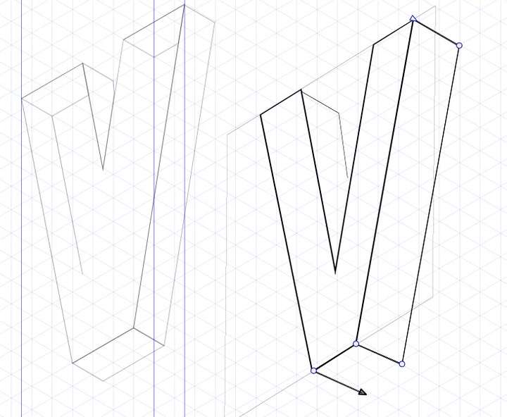
-
@Pat
quit a while ago i made a video for another post
about isometric drawingwhere i use a clone trick that may be helpful
keep your original plane while put a clone
of it in isometric so every change you made
on the original will be transferred to isometricthis could be helpful for complicated designs
or by using textyou could create planes for each side of your design
to use more then one shape create a group
and clone that group, you could use then "draw inside"
to put shapes and strokes in that groupand the "select members of a group.." Tool to
move shapes inside of the group
-
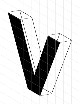
also made a quick isometric version
in affinity designers isometric studiomaybe this helps for comparison
-
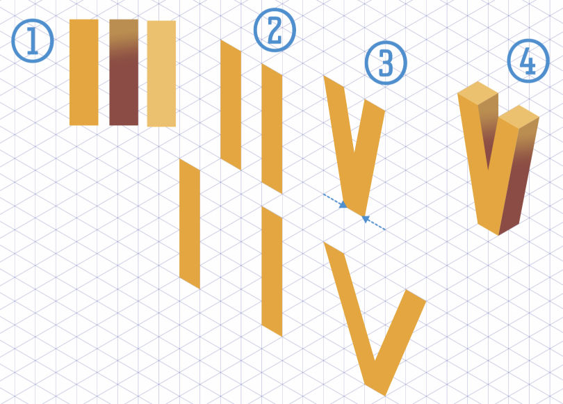
Hi everyone,
@Pat For drawing letters I have 2 ways :
For a modern (sans serif) letter, I would create rectangles and align them according to the isometric grid (with snapping on). I choose the space between the rectangle according to symmetry if needed, for a "V" 3 squares may be good, while "5" will bring weirder look (see image here). Stick to the grid, it's easier (in your case I see the surrounding square off the grid). Keep in mind that you can make your artworks big, using a lot of square count and snapping accuracy and then just shrink them later.
If you have serif letters or complex curvy shape ("S") I suggest that you type your text then use the iso settings in the transform panel (rotate, skew, scale). I have done actions to make things automatic. The preset and some experiments are in this folder.
For volume you may duplicate the result and use the shape builder in order to create the thickness part.I hope I'm clear enough. (I may need my second coffee
)
-
@Subpath @Devil-Dinosaur Thank you both for your feedback
it must also have something to do with the way I perceive isometric shapes and the way they're constructed (direction of false depth). Anyway, I'm going to continue decorating the letters
-
@Pat Yes, it can be tricky sometimes that's why I usually quickly put temporary colors in order to identify the shapes and their directions in space.
-
@Devil-Dinosaur Colours (& colour gradients) help indeed but I meant that some isometric shapes look unnatural to me... and clearly they are per se but I see more distortions for some forms than for others, and also depending of the orientation of the depth... well, a visual brain issue
-
@Pat said in Isometric Drawing Tutorial:
isometric shapes look unnatural to me... and clearly they are per se but I see more distortions for some forms than for others
I think it is a kind of optical phenomenon
where the brain will get confusedbecause we (our brain) are more familiar with
the real perspective than with the isometric one
-
@Subpath Yes, indeed.
If I look rapidly the two branches of the V one after the other for example, I've the feeling they are not in the same plane. But for many isometric letters and basic shapes, I don't have any issue.