Workspace
The typical elements of the VectorStyler user interface are labeled and described below. These elements may vary in function of customization, theming or VectorStyler version.
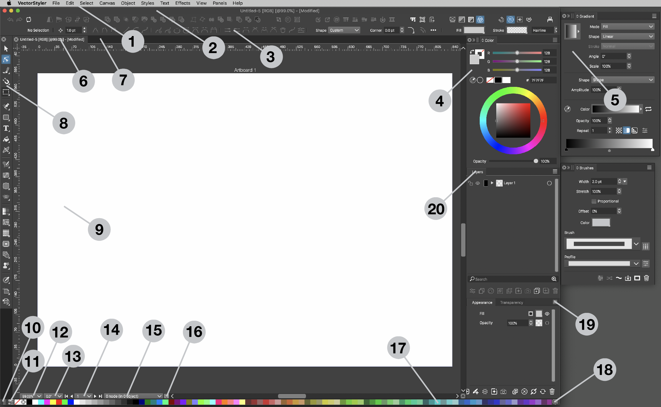
The various workspace elements of VectorStyler.
The following user interface elements are shon in the picture:
- The application menu used to access most of the VectorStyler commands.
- The main window of VectorStyler, containing docked tools, palettes and panels. The main window also contains the document views by default.
- The Context panel providing quick access to commonly used commands and attributes of the selected objects.
- Docked panels. These panels are docked into the main application window and will be moved or resized as the application window is changed.
- Floating panels. These panels are floating freely and can be positioned and resized arbitrarily.
- The title of an opened document. Multiple documents can be opened, each showing a title label, that can be used to activate the opened document for editing. By default, only one document is active, but document views can be arranged or detached to make multiple document views visible at the same time.
- The ruler of the document. The horizontal and vertical rulers are used to illustrate the object sizes, and to add or remove guidelines from the document. The corner formed at the intersection of the two rulers can be used to add two guidelines in one move.
- The main application toolbox containing the most common tools for editing objects. Some of these tools open an additional popup of tool choices.
- The document content, and the area used for interactive editing of objects.
- A title region of the color palette bar, used to drag the color bar to one of the four sides of the application window.
- A button that opens a menu of color palette options used on the displayed color palette.
- Current zoom level of the document view. It is possible to change the zoom by clicking on the arrows at the right side of the widget and selecting a zoom level from the menu, or input the desired numeric zoom level.
- Current document view rotation angle. The rotation angle can be directly edited or selected from a menu.
- Current artboard index and buttons to move to first, previous, next and last artboards.
- Displays information about the current selection. It is possible to change what information to show by clicking on this widget and selecting a choice from the popup menu.
- Document save widget. This widget indicates the amount of changes made on the document that were not saved. As more changes are made this widget turns into red indicating that document changes should be saved. By clicking on the widget the document is saved, returning the indicator tone to a neutral gray.
- Colors of the palette docked to the application window.
- Opens the docked color palette to show more colors.
- Opens a menu with additional options of the specific panel.
- The title label of a panel can be used to drag and drop the panel anywhere on the screen or into another panel.